
Management Level Dashboards
ORC has developed dashboards that combine and summarize multiple data layers to create user friendly experience to address specific questions posed by managers.
The example pictured displays one page of a dashboard. The tabs across the top represent the specific resource categories (Riparian, Rangeland Assessment, etc) that managers have identified. This case illustrates Rangeland Assessments. The map shows the entire BLM district. The underlying data can be searched by various management units that include ESD, pasture, or allotments throughout the entire district.
ORC’s dashboards are catered to the managers needs and interest. Nationally available 30-meter data layers can be limited in their species mapped and their scale often is too course for managers to act on. ORC can address species specific concerns and help you skip to the end with wall to wall 1-meter coverage summarized and visualized. Data layers are all packaged up in exportable and printable reports that can be specific to any management unit (ESD, Pasture or allotment). The reports contain all summarizations and visualizations for each individual resource category tab.
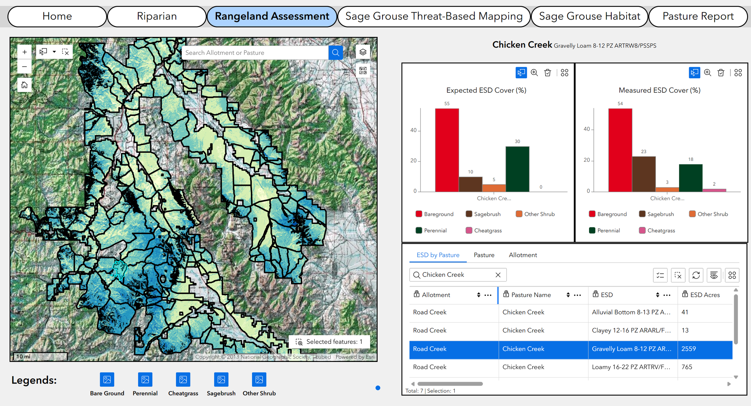
Figure 1. This Figure shows first the entire BLM District and all the pastures within. The map displayed shows high bareground cover in warm colors and low bareground cover in cooler colors. In the top righthand pane two bar charts show the comparison of the expected versus measured cover for each vegetation functional group within the Gravelly Loam 8-12 ESD. In the bottom righthand pane there is a tabular summary of all the ESD’s within the Chicken Creek pasture and their respective expected and measured cover values for all plant functional groups. This table can be exported in a variety of file types for use in excel, R, etc. Within the tabular pane you can query the data by different management units such as ESD, Pasture or Allotment. All the information presented throughout the entire window can be summarized and exported into a PDF or word document report. The report summarizes all tabs for each pasture or allotment not just the rangeland assessment tab.
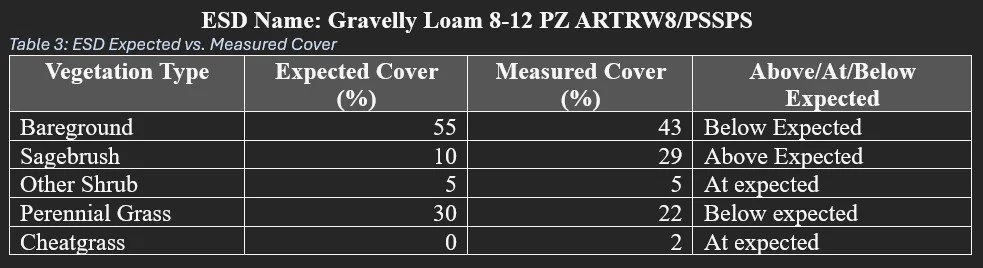
Table 1. This table show the quantitative data representing the Gravelly Loam 8-12 ESD within the Chicken Creek Pasture.
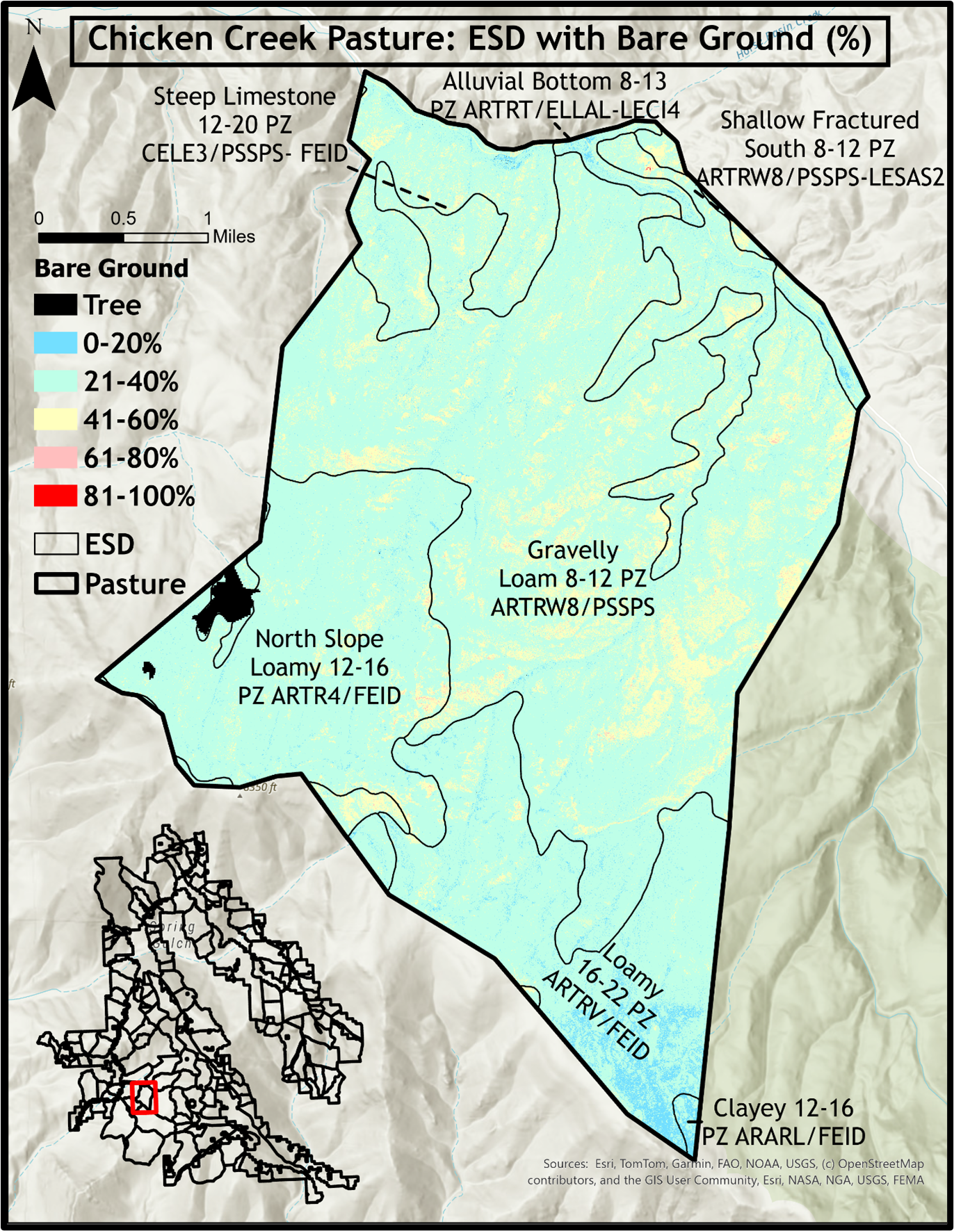
Figure 2. This figure shows the geographical distribution of the ESD’s and bareground cover throughout the Chicken Creek pasture. The ESD’s are shown as black lines and bareground is represented on a gradient. Cool colors indicating lower cover of bareground and warm colors indicating higher cover bareground.